

In this context, the availability of accessible, focused, timely and accurate information about spread and likely progression of the pandemic is crucially important.
Disease spread data serves as an enabler for the implementation of correct measures for minimizing the impact of the virus and understanding how important and effective such measures are. Interoperability in these data also allows for coordinating research and development on an international level and comparatively assessing the best plans of action and likely outcomes. Furthermore, spread data, combined with other knowledge enables data-driven research and innovation on solutions to the varying issues arising as the pandemic develops. Last and certainly not least, spread and measurement data allow to deliver information to the general population from authoritative sources and justify governmental response as well as tackle the spread of misinformation and fake news.
Spread and measurement data allow to deliver information to the general population from authoritative sources and justify governmental response as well as tackle the spread of misinformation and fake news.
Apart from disease spread/progression data, having the ability to access a variety of data sources outside of the standard CoVid-19 statistics is an important capacity that allows finding concealed patterns that affect contamination.
Issues with obtaining and using CoVid-19 related data
The CoVid-19 outbreak has put forth a number of technical and pure data management challenges that are difficult to overcome:
- Data are fragmented and there is no unified access to CoVid-19 data sources
Authoritative global data are managed by organizations such as John-Hopkins University, the ECDC, WHO, etc.; detailed data are managed nationally from national health authorities (e.g., the FHI in Norway), regional authorities (e.g., kommuner in Norway) and others.
- Available data is heterogeneous on several levels
Different information is made available in each dataset, different resolution of data (per country/region/city), different frequency of updates (typically daily at different times), different machine-readable formats (mostly CSV and JSON). Despite several initiatives, there is currently no unified way in which data are accessed and authoritative sources publish data using different information models.
- Pre-processing of data for analysis/R&D is costly and difficult
Data need to be downloaded, parsed and integrated into a consistent format by the person performing the analysis. This includes the process of identifying the individual data points, normalization of data measures and manual integration with external datasets (disambiguating and reconciling entities, identifying and retrieving the right data, integrating and normalizing the external data).
All of these issues are part of a general problem with data management in the process of digitalization related to the provisioning and integration of data and overcoming the issues of managing different data structures, information of the data, and managing data updates.
Case study: public data from the Norwegian Institute of Public Health
Earlier in 2020, the Norwegian Institute of Public Health (Folkehelseinstituttet) made available the Norwegian CoVid-19 surveillance dataset in tabular format (Excel and CSV files). Data in this dataset are updated automatically on a daily basis and stored in this GitHub repository where they can be accessed openly by anyone.
The dataset contains database dumps with demographic measurements and statistics about disease spread on a national, county and municipality levels, which constitute the statistical data that goes into many of the predictive models for disease spread and response planning. Data are organized in 7 tabular dump formats, each of which is accompanied by documentation (text file) that contains information about which columns of the dataset are used and how the entries can be interpreted.
All that in mind, in order to successfully access and work with the data, a user needs to tackle several data management issues. Firstly, the total number of data files in the repository is almost 1600 as of mid-December 2020. In addition to that, data are continuously updated, so in order to work with the latest data, a data scientist must set up a daily download, especially for the purposes of predictive analytics. Furthermore, some of the data are implicit – e.g., the date prefix (part of the name of each file) denotes the date of publication as well as the date of measurement of the statistical data in some cases. Not all the fields in the tables are used to provide data entries – some columns contain dummy data (note that this is clearly explained in the documentation). In addition to that, no standard data model is applied to the column structure and each file uses the column fields in different ways. With respect to integrating with external datasets (for example, with weather data in order to examine patterns of spread with respect to climate), there are no standard identifiers, geospatial coordinates, etc., which could allow to extract the necessary information from external sources.
Thus, a data analyst developing analytics models for CoVid-19 for Norway would need a wide range of technical and data modelling skills to successfully utilize these data.
Firstly, they would need to obtain comprehensive understanding of the implicit data model in the provided documentation and its relation to other data models. Furthermore, they would need comprehensive technical skills – e.g., knowledge of how to programmatically parse file names and include them in the data when preparing the data, how to extract data from CSV/Excel files, how to set up and manage a database, etc. With respect to integrating with external data, the analyst would need to figure out where they can obtain relevant other data and how to integrate them based on string matching or some other implicit identifier in the dataset (e.g., the international identifier of the county/municipality).
Knowledge representation of CoVid-19 related data
In order to tackle some of the challenges of data management of CoVid-19 related data we have started an internal initiative to publish CoVid-19 related data. Here we briefly look at some of the current publicly available results.
- Note that other relevant datasets and extensions to this work are being developed. Updated information of the available data will be made available at this web address. In the future, we intend to create a data catalogue where we publish links to or integrate multiple relevant datasets related to the CoVid-19 pandemic.
The CoVid-19 measurements data model
Data models provide a common structure for publishing data, which allows it then to be homogenized. Our goal has been to create a data model for publishing datasets with statistics related to CoVid-19 that are accessible, re-usable, understandable, interoperable and easily available. Nevertheless, coming up with a common data model requires also a common understanding of the concepts covered by the data model and this is where Semantic Web data structures (i.e., Linked Data) come in handy.
In brief, Linked Data is a method for publishing data on the Web that uses self-describing data and relations in a graph data model. Data integration is typically done through interlinking entities in distributed data sources through their unique URIs. The definition of Linked Data models is done through the knowledge representation languages called RDF Schema (RDFS) and Web Ontology Language (OWL). What is especially useful about the Linked Data models is that they provide well-defined semantics for all schema types and properties. We use these well-defined semantics to refer to specific Linked Data schema items that are in our own data model (e.g., GeoNames). This logically associates any published data to external knowledge bases and allows for easy external data integration.
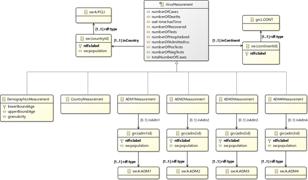
Our data model defines the types of statistical measurements about viral spread. It also provides points of integration with other datasets through the use of common identifiers between knowledge graphs. One direction this has been done is through the association with data model concepts about spread locations to standard and well-defined models of geographical entities (i.e., GeoNames). This allows to retrieve additional geolocation/demographics data (e.g., population in countries/municipalities/cities, area coordinates) from the geographical knowledge base where this information is obtained. This approach also enables semantic reconciliation and extension with external data through retrieving geolocation-based datasets (e.g., getting weather data for areas where spread information is available). The following figure shows the current logical structure of the data model (detailed documentation about the CoVid-19 measurements data model is available on Github).
Using our data model to publish CoVid-19 data from the Norwegian Institute of Public Health in RDF
In order to showcase the usability of the data management approach and data model, we have now published and made available the surveillance data from the Norwegian Institute of Public health. The output format we have chosen to publish is RDF as it can be easily made publicly available for access through a standard query interface (SPARQL endpoint).
The data are updated daily and have been made available through two endpoints:
- Publically available GraphDB SPARQL endpoint – https://graphdb.sintef.cloud/
All of the derived data are uploaded daily to a GraphDB RDF triple store, which allows to issue queries and explore the database content through its GraphDB Workbench UI.
- RDF dump of latest data: https://covid-19-data.sintef.cloud/data/covid-19-data.nt
After each update of the GraphDB triple store all available data are dumped to a publicly available endpoint that can be used to store it in other triple stores.
Please refer to the official dataset documentation for more details on how to download and access the data. The page provides detailed information about the granularity of the available data, how to access the data (including example queries to the publicly available endpoint), as well as the data transformations that have been used to map the input datasets to the data model. The repository on GitHub where the documentation is published also provides executable and deployable scripts for the data publication pipelines used to generate the data as well as other useful information about ongoing work.


Comments
No comments yet. Be the first to comment!